Is the Dashboard Pattern Dead?
Android application design has experienced radical change over the last two years. It has transitioned into an OS that can be executed on mobile devices, tablets and now television sets. In this blog post, I'd like to discuss what could be behind the most obvious user interface layout changes - the decline of the dashboard pattern and the emergence of several alternatives.
The Dashboard Pattern
At Google I/O 2010 the Twitter and iosched apps were published with the intention of demonstrating recommended UI design patterns. One of these was the dashboard - a grid of icons serving as a top-level menu.
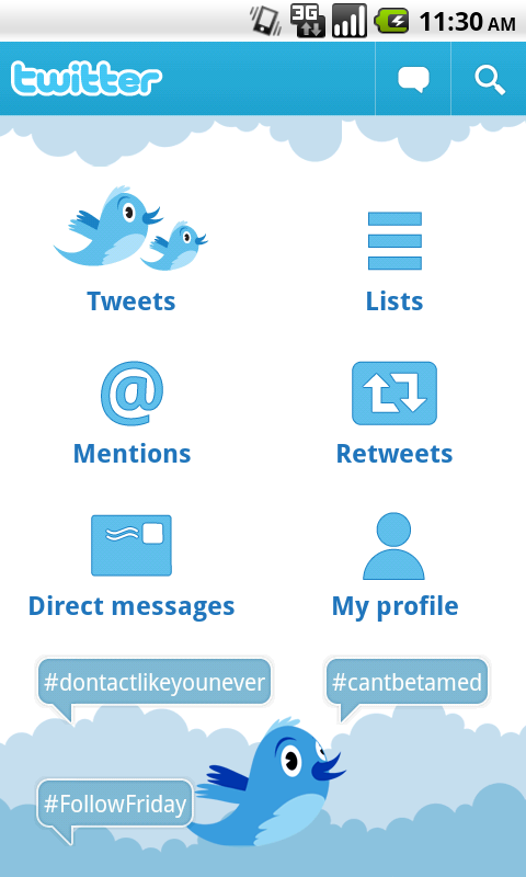
New users to an application are 'oriented' by a dashboard; they are shown the functionality that is provided by the app. However, this has a short-term positive effect before it becomes a hindrance. Dashboards can have a limiting factor, as more obscure functionality may not be discovered. There is an extra menu to navigate through to switch between top-level activities - 'sideways navigation' is not supported. It is possible for users to forget what they were trying to do when they return to the dashboard screen. Our brains have a short-term memory which can be hard to access after crossing a boundary. I often have an idea whilst walking and as soon as I walk through my front door I forget it!
Applications that once used the dashboard, such as Facebook, Twitter, Google+ and Evernote have since switched to different layout techniques. Why is this?
The Design Guide
The design guide was published at the beginning of this year. It explains in depth the principles behind Android application design, such as the use of fragments, the action bar and how to structure applications. Interestingly, it does not advocate using a specific UI pattern for navigation, instead the focus is on providing advice to let developers make the right choice for their application. The advice it gives is:
"Avoid navigation-only screens and instead let people get to the meat of your app right away by making content the centrepiece of your start screen."
"Choose layouts that are visually engaging and appropriate for the data type and screen size."
"Minimize perceived navigation effort by keeping your apps shallow."
Whilst this advice does not advocate the use of a particular design pattern, it is implying that developers should not use the dashboard pattern, which violates all of these principles. So, what are the alternatives that are rising in its place?
Grid Layout
Menu items are presented as cells within a grid. Cells in the grid may take up more than one column or row, which presents an irregular layout but allows for one item to be given prominence over others in the grid. It is typical to see vertical or horizontal scrolling present on a grid, but not both.Grid layouts are arguably very similar to the dashboard, in that they present a grid of menu items. Where grids differ however is with their ability to give prominence to particular items. Google Play is the most well-known example of this layout pattern, using a grid to separate out navigation to its four stores (apps, books, movies and music) and using other entries to provide 'deep links' into the application. For example, in the screenshot below there is a link to 'games' and to featured content.

Another application which uses this layout is Songkicks, a concert-planning application utilising the user's music library and location. This information is also used to personalise the content within the grid layout.

Technically this form of layout is still a dashboard, albeit with the added ability of scrolling and more scope for personalisation. Many of the negatives associated with the dashboard are shared - this is still a navigation-only screen affording no 'sideways' navigation between menu items. Whilst the room for personalisation and the ability to add deep links do recognise the need to bring content forward, this can only be considered a baby step. Grids with few items, such as in the Songkicks example above, could be considered as a waste of space. Grids with many items are not suitable as top-level menus, given the design guide advice to keep application structure shallow.
Sliding Drawer
Applications designed according to this technique do not allocate an individual screen to a top-level menu. Instead, one of the items in the menu is considered the 'main' activity and this is shown on startup. To access the menu, the user performs some action. This causes the menu to slide in from screen-left, pushing the current activity to the right but keeping it slightly visible.

This pattern is extremely popular at the moment. It is implemented in many of the top applications including Google+, Facebook, Spotify and Evernote. This pattern represents a good compromise between the need for a top-level hierarchy and conforming to the design guide advice. Content is made centre-stage, with the navigation elements only being displayed when the user wants to interact with them. This certainly avoids navigation-only screens and aids keeping applications shallow. Additionally, it is possible for this style of menu to contain more items than a dashboard due to the presence of a scrollbar, making this technique useful for applications such as Facebook which have, by necessity, a large number of top-level menu items.
In terms of the number of interactions needed to navigate between two child items of a menu, this technique and the dashboard are identical. Firstly, the menu has to be displayed, followed by an item selection. The key difference is that the menu and the current activity are displayed simultaneously, which mitigates the boundary-memory issue.
The biggest drawback to this navigation technique is the inconsistency between the myriad of implementations, specifically regarding the width of the sliding drawer and how to show it. Integration with the action bar is the main difference in implementation. Facebook and Spotify replace the action bar logo with a button to launch the sliding drawer ( ). Evernote displays the sliding drawer when the action bar logo is pressed, whereas Google+ and YouTube utilise the concept of navigating 'up': the action bar logo displays the 'up' icon, which launches the sliding drawer when pressed (
 ). Swiping left to display the sliding drawer is also a nice, complementary technique that is implemented in YouTube, Spotify and Evernote.
Using 'up' to display the sliding drawer is semantically correct and in my opinion the implementation which should be standardised upon. It would be nice for some consistency, at least!
Fragments and the Action Bar
To improve the usability of Android and to better support multi-pane tablet layouts, Honeycomb introduced the concepts of Fragments and the Action Bar. Fragments are reusable UI elements which are hosted in a parent Activity. Think of a master-detail view as two fragments inside one containing Activity. The Action Bar is a persistent row at the top of the screen showing application branding and acting as a dock for navigation elements and common action shortcuts. The Action Bar was introduced in the same Google I/O presentation as the dashboard and has been incorporated into the framework, unlike the dashboard!
This pattern aims to use fragments to focus on presenting content from each of the top-level menu items. Where possible these are displayed together on one large screen to provide an information-dense application. When it is not possible to display the fragments together, each fragment is made its own full-screen tab page and a series of tab page headers is added to the Action Bar, or on a separate row underneath the main action bar.
The prime example of how this layout technique works is the iosched 2012 application. There are three top level items: an agenda, a live social network feed and a list of available conference sessions. Tablets display three side-by-side views:


Twitter has a similar, although less complete, implementation of this pattern. It does not yet have a tablet-optimised layout and its customised header style is too closely-linked to iOS. On Android it is common to use text rather than icons as tab headers.

Gmail also uses a similar layout structure for a master-detail view. Tablet devices display the inbox and a selected email side-by-side. On smaller devices the inbox and email are displayed on separate screens. However, in this configuration 'sideways' navigation is supported as the user can swipe left or right to read other emails without returning to the inbox screen. Utilising shortcuts like this mitigates boundary memory loss, by removing the need to go through the boundary.
In a similar manner to the sliding drawer technique, this method presents the application content to the user without needing navigation-only screens. Navigation elements are only shown on screens which cannot display multi-pane layouts. On the other hand if the navigation is needed it cannot be hidden like a sliding drawer can be. There is a limit to the amount of tab headers which can be displayed, thus limiting the scope of this solution to applications with small numbers of top-level items. Therefore this technique will result in shallow application structures.
Conclusion
Good Android design optimises layouts for devices with various different screen sizes. To achieve this it is advisable to arrange UI elements into reusable fragments, incorporate the action bar and make the prime content of the application discoverable. Clearly the dashboard is no longer fit for purpose. Grid layouts should be used with caution due to their similarity to the dashboard pattern.
There is commonality between the sliding drawer and fragments/action bar approaches. They are both trying to solve the problem of making content the centrepiece of an application. The two approaches represent different trade-offs between the discoverability of content and navigation.
The use of fragments and tabs on the action bar is the closest fit to the advice given in the design guide, although practically speaking this is only suitable when the number of top-level items is small. On smaller devices the tab pages take up a second 'row' onscreen and this eats into the already-limited screen space. For applications which many top-level items (such as Facebook), it is more practical to utilise the sliding drawer technique, preferably the YouTube implementation (uses the Up button and gestures). I'm calling this a draw.